Some features nobody thanks you for, some get better the more you invest, and some nobody asked for but everyone loves. Here is how Noriaki Kano's model tells them apart, how to run the survey behind it, and what it says about six feature requests.
By Martin Lasek · Oct 5, 2026 · 11 min read
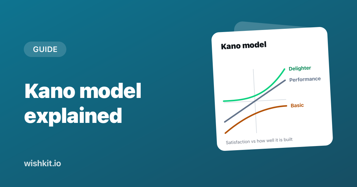
The Kano model sorts features by how they change the way people feel about a product. Some only matter when they are missing, some please people more the better they get, and some delight people who never thought to ask for them. Knowing which kind a feature request is changes what you build first.
This guide explains the five Kano categories, shows how to run the Kano survey and read its evaluation table, and works through six feature requests from one app. Plant Diary is a made-up app for the examples, the same one as in the MoSCoW and RICE guides.
The Kano model puts every feature into one of five categories by asking users two questions about it: how they would feel if the product had it, and how they would feel if it did not. Must-be features only frustrate when they are missing. One-dimensional features please people more the better they are. Attractive features delight, but nobody misses them. Indifferent features change nothing, and reverse features annoy some of the people who get them.
Noriaki Kano, then a professor at the Tokyo University of Science, published the model in 1984 with Nobuhiko Seraku, Fumio Takahashi and Shinichi Tsuji. Their paper, Attractive Quality and Must-Be Quality, appeared in the journal of the Japanese Society for Quality Control. It argued that satisfaction has two dimensions rather than one, and tested the idea with a consumer survey about TV sets and table clocks.
Western product teams learned the method in the early 1990s through the Center for Quality of Management in Cambridge, Massachusetts. Its journal's fall 1993 issue, Kano’s Methods for Understanding Customer-defined Quality, is still the most practical description of the survey, and the quotes in this guide come from it.
Kano drew each category as a curve: how satisfied people are, against how well the feature is built. The chart puts the six requests from the worked example further down on those curves.
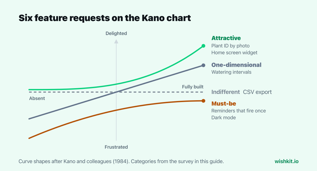
People take these for granted. Done well, nobody notices. Done badly, people are angry. Some teams call them dissatisfiers, since they can only cost you satisfaction. For Plant Diary, a reminder that fires exactly once is a must-be. Nobody praises it, but a reminder that fires twice gets one-star reviews.
Satisfaction grows in a straight line with how well these are built. They are what people compare products on and what they mention when you ask what they want. Watering intervals per plant are one-dimensional: the more closely the app fits each plant's schedule, the happier people are.
People don't expect these, so nobody is disappointed when they are missing. When they are there, they delight. The 1993 journal gives a car example:
"For instance, an automobile customer may not be unsatisfied if the radio antenna does not automatically lower itself into the car body when the radio is turned off, but the customer may be more satisfied when the car has this feature."
Plant ID by photo is attractive for Plant Diary. Nobody expects a watering app to name the plant on the windowsill, which is exactly why it impresses the people who try it.
Some features change nothing either way. The journal's example is "having a cigarette lighter in a car." CSV export is indifferent to most Plant Diary users. It still matters to the few who keep spreadsheets of their plants, which is a reason to check who the indifferent answers come from.
Some people would rather not have the feature at all. Streaks and badges for watering on time are a typical reverse feature: some people enjoy the nudge, others find it childish and would switch it off. If most answers for a feature come out reverse, the question was asked the wrong way round. A sixth result, questionable, comes from answers that contradict each other, like liking a feature and also liking not having it. Those pairs are left out.
Here is one pair from Plant Diary's survey. Pick an answer to each question and the result below shows the category the evaluation table gives.
If you can set a watering interval for each plant, how do you feel?
If all your plants have to share one watering interval, how do you feel?
Every answer pair maps to one category. The rows are the answer to the first question, when the product has the feature. The columns are the answer to the second, when it lacks it.
| Has it ↓ Lacks it → |
Like | Must be | Neutral | Live with | Dislike |
|---|---|---|---|---|---|
| Like | Q | A | A | A | O |
| Must be | R | I | I | I | M |
| Neutral | R | I | I | I | M |
| Live with | R | I | I | I | M |
| Dislike | R | R | R | R | Q |
A is attractive, O one-dimensional, M must-be, I indifferent, R reverse and Q questionable. The table is the one in the 1993 journal. Three cells are worth remembering. Liking a feature and disliking its absence is one-dimensional, the only pair where both answers are strong. Liking it while being fine without it is attractive. Expecting it or not caring, but disliking its absence, is must-be. Most of the middle is indifferent.
Plant Diary sent the survey to the 120 people who had voted on its feedback board. These are the six requests and how their answer pairs scored:
| Request | A | O | M | I | R | Q | Category |
|---|---|---|---|---|---|---|---|
| Reminders that fire once | 6 | 22 | 70 | 18 | 2 | 2 | Must-be |
| Watering intervals | 24 | 58 | 20 | 14 | 2 | 2 | One-dimensional |
| Dark mode | 12 | 20 | 52 | 34 | 1 | 1 | Must-be |
| Home screen widget | 48 | 16 | 8 | 46 | 1 | 1 | Attractive |
| Plant ID by photo | 64 | 12 | 4 | 34 | 4 | 2 | Attractive |
| CSV export | 10 | 8 | 6 | 92 | 2 | 2 | Indifferent |
The category is the most common result. The journal puts it plainly: "The simplest way to choose a category is to use whatever code appears most often in the responses for that requirement."
The home screen widget is the row to look at twice. 48 people found it attractive and 46 were indifferent, which is almost a tie. The journal's advice for that case:
"If two or more categories are tied or close to tied, it may be an indication that more information is needed: You may be dealing with two market segments, or you may need to ask questions about more detailed customer requirements."
Splitting Plant Diary's answers by a question about the home screen settles it. People who already use widgets from other apps rated it attractive. People who don't were indifferent. It is a delighter for one group, not a lukewarm feature for everybody.
Taking the most common answer throws away the rest of the row. In the same 1993 issue, Mike Timko of Analog Devices reduced each row to two numbers: "a positive number that is the relative value of meeting this customer requirement (versus the competition), and a negative number that is the relative cost of not meeting this customer requirement."
Reverse and questionable answers are left out. For Plant Diary:
| Request | Category | Better | Worse |
|---|---|---|---|
| Reminders that fire once | Must-be | 0.24 | −0.79 |
| Watering intervals | One-dimensional | 0.71 | −0.67 |
| Dark mode | Must-be | 0.27 | −0.61 |
| Home screen widget | Attractive | 0.54 | −0.20 |
| Plant ID by photo | Attractive | 0.67 | −0.14 |
| CSV export | Indifferent | 0.16 | −0.12 |
The journal's order for breaking ties works for the whole list: must-be first, then one-dimensional, then attractive, then indifferent, written as "M > O > A > I". Applied to Plant Diary:
Must-bes come first only while they are broken or missing. Once one works, polishing it buys nothing:
"Improving performance on a Must-be customer requirement that is already at a satisfactory level is not productive when compared to improving performance on a One-dimensional or Attractive customer requirement."
This order differs from the RICE example for the same app. RICE put dark mode last, because its impact on each person looked low. Kano shows what that number missed. Dark mode is a missing basic, so the people who want it won't be delighted when it ships. They will stop being annoyed, which is worth more than its votes suggest.
Kano categories are not permanent. In a 2001 paper, Life Cycle and Creation of Attractive Quality, Kano described how a quality that starts out attractive can turn into a must-be as people get used to it.
Dark mode is the example in this survey. When iOS 13 added a system-wide dark mode in September 2019, an app that supported it stood out. Today an app without it looks unfinished at night. Plant ID by photo may go the same way once every plant app has it. That gives a Kano survey a shelf life. Run it again every year or so, and before a big release.
A vote count says how many people want something. Kano says what kind of want it is. Must-be needs rarely get votes until they break: Plant Diary's double reminders came in as 12 bug reports, not as a request. Delighters get fewer votes than they deserve, because people rarely ask for what they can't imagine. And an indifferent request can still collect votes from a small, loud group.
The two work best together. Use the votes to choose which requests go into the survey, and send it to the people who voted, since they care enough to answer everything twice. WishKit collects those votes for websites and SaaS products, and inside iOS apps with a native SDK.
For a release with a fixed date, MoSCoW prioritization decides what has to ship. Kano is better at the question before that: which requests people would miss, and which ones would surprise them.
A way to sort product features by how they affect customer satisfaction, published by Noriaki Kano and his colleagues in 1984. A two-question survey puts each feature into one of five categories: must-be, one-dimensional, attractive, indifferent or reverse.
Must-be features people expect, which only frustrate when missing. One-dimensional features, where satisfaction grows with quality. Attractive features that delight but are not missed. Indifferent features that change nothing. Reverse features some people would rather not have.
Look up each person's two answers in the Kano evaluation table to get a category, count the categories for each feature, and take the most common one. For more detail, compute Better = (A + O) ÷ (A + O + M + I) and Worse = −(O + M) ÷ (A + O + M + I).
Each feature gets a pair: "If you can set a watering interval for each plant, how do you feel?" and "If all your plants have to share one watering interval, how do you feel?" Both are answered with I like it that way, It must be that way, I am neutral, I can live with it that way, or I dislike it that way.
RICE ranks features by a score built from reach, impact, confidence and effort. Kano sorts them by the kind of satisfaction they create and ignores effort. Kano tells a missing basic from a nice extra, RICE orders a long list.
Noriaki Kano, a professor at the Tokyo University of Science, with Nobuhiko Seraku, Fumio Takahashi and Shinichi Tsuji, in a 1984 paper titled Attractive Quality and Must-Be Quality.
Setup takes less than a minute. Free plan included, no credit card required.
Try WishKit for free