Two questions per idea, how much it helps and how much it costs, and a long list sorts itself into four boxes. Here is how to score both axes honestly, ten feature requests sorted, and a template that sorts your own list.
By Martin Lasek · Oct 5, 2026 · 8 min read
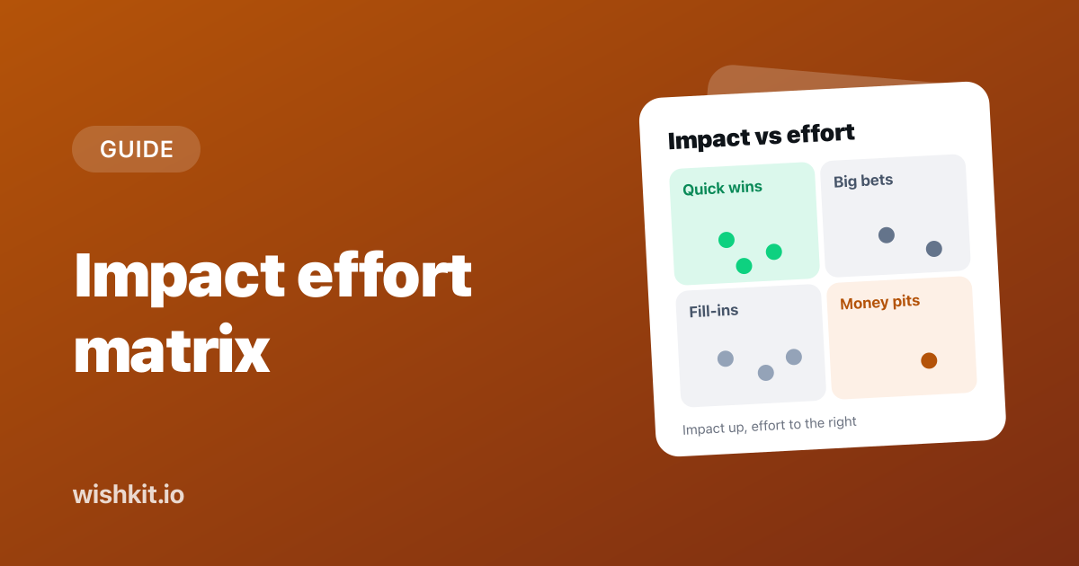
An impact effort matrix is a 2×2 grid that sorts ideas by two questions: how much will this help, and how much work is it? Ideas with high impact for little effort land in quick wins, the box you start with. The same grid goes by effort impact matrix, impact effort grid and value effort matrix.
This guide covers the four quadrants, how to score both axes so a team agrees on them, ten feature requests from one app sorted into the grid, and a template that sorts your own list. Plant Diary is a made-up app for the examples, the same one as in the MoSCoW, RICE and Kano guides.
Score every idea for impact and effort on scales the whole team shares, draw one line across each axis, and you get four boxes. Do the quick wins (high impact, low effort) first, plan the big bets (high impact, high effort), fit the fill-ins (low impact, low effort) in when there is time, and drop the money pits (low impact, high effort).
The reason the matrix exists. These ideas help many people and cost little, so they go first. If this box is crowded, check the effort estimates before you celebrate. Crowded quick wins are the most common sign of an estimate problem, covered further down.
Also called major projects. Worth doing, but they need a plan, a slot on the roadmap and usually a smaller first version. Most of what makes a product better over a year lives in this box.
Small things that help a few people. They suit a quiet afternoon or a new teammate's first week. They become a problem when they fill a whole release because each one felt cheap.
Also called thankless tasks. They take a lot and change little. Say no, or keep them on a list until something makes them cheaper or more important.
Lean Six Sigma teams use the same grid under the name PICK chart, after its four boxes: Implement for the easy, high payoff ideas, Challenge for the hard ones, Possible for easy ideas with little payoff, and Kill for the rest. Same quadrants, blunter names.
The matrix has no single inventor. Two-by-two grids for decisions are old. In an article on prioritization matrices, Nielsen Norman Group notes that "many time-management matrices are based on the Eisenhower Method", which sorts tasks by urgent and important. Quality teams adopted the impact and effort version to choose between improvement ideas, and product teams to choose between feature requests. The axes change names, value or benefit instead of impact, ease or cost instead of effort, but the grid stays the same.
A matrix is only as good as its two numbers. When everyone scores with their own idea of "high", the grid shows opinions rather than ideas. Five rules keep it honest:
Nielsen Norman Group recommends the same silent first round for its prioritization workshops:
"This step will not only speed up the process and provide structure for plotting, but it will also prevent the loudest person in the room from dominating the outcome of the exercise."
Plant Diary's board has ten open requests with votes from the last quarter, and the developer estimated each one in days of work. The lines sit at 30 votes and five days.
| Request | Votes | Days | Quadrant |
|---|---|---|---|
| Watering intervals | 64 | 6 | Big bet |
| Home screen widget | 51 | 5 | Quick win |
| Sync across devices | 47 | 14 | Big bet |
| Fertilizer reminders | 41 | 2 | Quick win |
| Dark mode | 38 | 3 | Quick win |
| Plant ID by photo | 33 | 20 | Big bet |
| Apple Watch app | 22 | 15 | Money pit |
| Plant photo diary | 19 | 5 | Fill-in |
| CSV export | 9 | 1 | Fill-in |
| German translation | 7 | 2 | Fill-in |
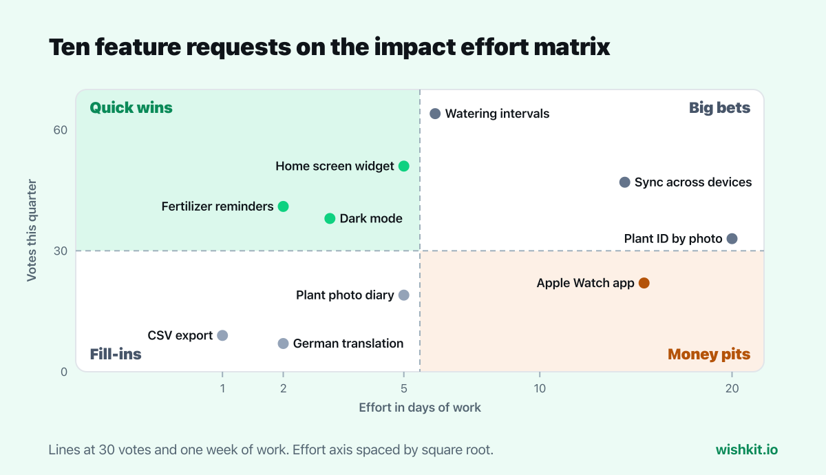
Two things the grid can't show. Sync is a big bet here, but in the MoSCoW example it is a Must, because it was promised for version 2.0. And the bug that sent reminders twice is not on the grid at all. A broken basic doesn't compete with requests for a slot, it gets fixed. The Kano model explains why.
Type your own requests into the table, with impact and effort in whatever units your team agreed on, and set the two lines. The four boxes update as you type, each sorted by impact per unit of effort. Nothing you enter leaves your browser.
| Request | Impact | Effort | |
|---|---|---|---|
Quick wins
High impact, low effort. Do first.
Big bets
High impact, high effort. Plan them.
Fill-ins
Low impact, low effort. When there is time.
Money pits
Low impact, high effort. Drop them.
The most common failure has a name. People underestimate how long their own work will take, and they keep doing it even when they know their past estimates were too low. Psychologists call it the planning fallacy. In a 1994 study, students estimated how long their senior thesis would take:
"When asked for their best estimate, respondents predicted, on average, that they would finish in 33.9 days, but they actually took 55.5 days"
Even the estimates they made assuming everything would go as badly as possible came in short on average. On an impact effort matrix the effect is predictable: effort estimates drift low, and the quick wins box fills up with ideas that turn out not to be quick.
Impact is where most matrices go wrong, because it is usually a guess made in a meeting. Votes are counted the same way for every request, they come from the people who would use the feature, and nobody can argue them up by talking louder. They measure how many people want something rather than how much it helps each of them, so add RICE prioritization or a Kano survey when that difference matters. The guide to feature prioritization puts all five frameworks side by side.
A feature request board collects the votes as a side effect: users post ideas and vote on each other's. WishKit does that for websites and SaaS products, and inside iOS apps with a native SDK.
A 2×2 grid that sorts ideas by how much they help (impact) and how much work they take (effort). Its four boxes are quick wins, big bets, fill-ins and money pits.
Quick wins: high impact, low effort, do them first. Big bets: high impact, high effort, plan them. Fill-ins: low impact, low effort, do them when there is time. Money pits: low impact, high effort, drop them.
With a number everyone can check, such as votes on a feature request, the number of affected customers or the revenue at stake. If no number exists, use a 1 to 5 scale with a written example for each step, and score alone before the discussion.
In days of work for everyone involved, including design, testing and release, compared with similar work you already shipped. People underestimate their own tasks, so check estimates against how long past work really took.
RICE turns reach, impact, confidence and effort into one score and ranks every idea. The impact effort matrix only sorts ideas into four boxes. The matrix is faster for a first pass, RICE is better when you need a strict order.
The Lean Six Sigma version of the impact effort matrix. Its four boxes are Possible (easy, low payoff), Implement (easy, high payoff), Challenge (hard, high payoff) and Kill (hard, low payoff).
Setup takes less than a minute. Free plan included, no credit card required.
Try WishKit for free