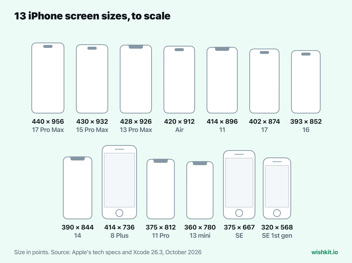
Every iPhone since the 6s in inches, points and pixels.
Straight from Apple's tech specs and Xcode.
44 iPhones, 13 sizes in points
Open this page on your iPhone and the table marks every model with your screen size.
375 × 667iPhone SE
402 × 874iPhone 17
440 × 956iPhone 17 Pro Max
drawn to scale
Apple's numbers
Specs and Xcode
Points and pixels
Plus scale and ppi
No login
100% free
The short answer
The newest iPhones range from 6.1 inches (iPhone 17e) to 6.9 inches (iPhone 17 Pro Max and iPhone 18 Pro Max). In points, the unit SwiftUI, UIKit and Safari lay out in, that is 390 × 844 up to 440 × 956. All 44 iPhones in the table share just 13 sizes in points, so testing those sizes covers every model.
Every iPhone screen size
Open this page on an iPhone and it shows which models share your screen. Tap a column to sort.
Your screen
Device
Display
Points
Pixels
Scale
App Store screenshots
PPI
iPhone 18 Pro Max*2026
6.9"6.86" measured
440 × 956
1320 × 2868
@3x
Dynamic Island (large display)
460
iPhone 18 Pro*2026
6.3"6.27" measured
402 × 874
1206 × 2622
@3x
Dynamic Island (medium display)
460
iPhone 17e2026
6.1"6.06" measured
390 × 844
1170 × 2532
@3x
Face ID (medium display)
460
iPhone 17 Pro Max2025
6.9"6.86" measured
440 × 956
1320 × 2868
@3x
Dynamic Island (large display)
460
iPhone 17 Pro2025
6.3"6.27" measured
402 × 874
1206 × 2622
@3x
Dynamic Island (medium display)
460
iPhone 172025
6.3"6.27" measured
402 × 874
1206 × 2622
@3x
Dynamic Island (medium display)
460
iPhone Air2025
6.5"6.55" measured
420 × 912
1260 × 2736
@3x
Dynamic Island (large display)
460
iPhone 16e2025
6.1"6.06" measured
390 × 844
1170 × 2532
@3x
Face ID (medium display)
460
iPhone 16 Pro Max2024
6.9"6.86" measured
440 × 956
1320 × 2868
@3x
Dynamic Island (large display)
460
iPhone 16 Pro2024
6.3"6.27" measured
402 × 874
1206 × 2622
@3x
Dynamic Island (medium display)
460
iPhone 16 Plus2024
6.7"6.69" measured
430 × 932
1290 × 2796
@3x
Dynamic Island (large display)
460
iPhone 162024
6.1"6.12" measured
393 × 852
1179 × 2556
@3x
Dynamic Island (medium display)
460
iPhone 15 Pro Max2023
6.7"6.69" measured
430 × 932
1290 × 2796
@3x
Dynamic Island (large display)
460
iPhone 15 Pro2023
6.1"6.12" measured
393 × 852
1179 × 2556
@3x
Dynamic Island (medium display)
460
iPhone 15 Plus2023
6.7"6.69" measured
430 × 932
1290 × 2796
@3x
Dynamic Island (large display)
460
iPhone 152023
6.1"6.12" measured
393 × 852
1179 × 2556
@3x
Dynamic Island (medium display)
460
iPhone 14 Pro Max2022
6.7"6.69" measured
430 × 932
1290 × 2796
@3x
Dynamic Island (large display)
460
iPhone 14 Pro2022
6.1"6.12" measured
393 × 852
1179 × 2556
@3x
Dynamic Island (medium display)
460
iPhone 14 Plus2022
6.7"6.68" measured
428 × 926
1284 × 2778
@3x
Face ID (large display)
458
iPhone 142022
6.1"6.06" measured
390 × 844
1170 × 2532
@3x
Face ID (medium display)
460
iPhone SE (3rd generation)2022
4.7"
375 × 667
750 × 1334
@2x
Home Button (medium display)
326
iPhone 13 Pro Max2021
6.7"6.68" measured
428 × 926
1284 × 2778
@3x
Face ID (large display)
458
iPhone 13 Pro2021
6.1"6.06" measured
390 × 844
1170 × 2532
@3x
Face ID (medium display)
460
iPhone 132021
6.1"6.06" measured
390 × 844
1170 × 2532
@3x
Face ID (medium display)
460
iPhone 13 mini2021
5.4"5.42" measured
360 × 780
1080 × 2340
@3x
Face ID (medium display)
476
iPhone 12 Pro Max2020
6.7"6.68" measured
428 × 926
1284 × 2778
@3x
Face ID (large display)
458
iPhone 12 Pro2020
6.1"6.06" measured
390 × 844
1170 × 2532
@3x
Face ID (medium display)
460
iPhone 122020
6.1"6.06" measured
390 × 844
1170 × 2532
@3x
Face ID (medium display)
460
iPhone 12 mini2020
5.4"5.42" measured
360 × 780
1080 × 2340
@3x
Face ID (medium display)
476
iPhone SE (2nd generation)2020
4.7"
375 × 667
750 × 1334
@2x
Home Button (medium display)
326
iPhone 11 Pro2019
5.8"5.85" measured
375 × 812
1125 × 2436
@3x
Face ID (medium display)
458
iPhone 11 Pro Max2019
6.5"6.46" measured
414 × 896
1242 × 2688
@3x
Face ID (large display)
458
iPhone 112019
6.1"6.06" measured
414 × 896
828 × 1792
@2x
Face ID (large display)
326
iPhone XS2018
5.8"5.85" measured
375 × 812
1125 × 2436
@3x
Face ID (medium display)
458
iPhone XS Max2018
6.5"6.46" measured
414 × 896
1242 × 2688
@3x
Face ID (large display)
458
iPhone XR2018
6.1"6.06" measured
414 × 896
828 × 1792
@2x
Face ID (large display)
326
iPhone X2017
5.8"5.85" measured
375 × 812
1125 × 2436
@3x
Face ID (medium display)
458
iPhone 82017
4.7"
375 × 667
750 × 1334
@2x
Home Button (medium display)
326
iPhone 8 Plus2017
5.5"
414 × 736
1080 × 1920renders at 1242 × 2208
@3x
Home Button (large display)
401
iPhone 72016
4.7"
375 × 667
750 × 1334
@2x
Home Button (medium display)
326
iPhone 7 Plus2016
5.5"
414 × 736
1080 × 1920renders at 1242 × 2208
@3x
Home Button (large display)
401
iPhone SE (1st generation)2016
4"
320 × 568
640 × 1136
@2x
Home Button (4" display)
326
iPhone 6s2015
4.7"
375 × 667
750 × 1334
@2x
Home Button (medium display)
326
iPhone 6s Plus2015
5.5"
414 × 736
1080 × 1920renders at 1242 × 2208
@3x
Home Button (large display)
401
No device matches that search.
* Newer than Xcode 26.3, so its points assume @3x, like every iPhone with Face ID since the iPhone 12.
Building an iPhone app? Let your users vote on what to build next.
Layouts are built in points, not pixels, so two iPhones with the same size in points show your app exactly the same, even when their pixel counts differ. The iPhone XR and the iPhone XS Max are the clearest case: one renders at @2x and the other at @3x, and both are 414 × 896 points.
Points
Scale
iPhones
440 × 956
@3x
iPhone 18 Pro Max, iPhone 17 Pro Max, iPhone 16 Pro Max
430 × 932
@3x
iPhone 16 Plus, iPhone 15 Pro Max, iPhone 15 Plus, iPhone 14 Pro Max
428 × 926
@3x
iPhone 14 Plus, iPhone 13 Pro Max, iPhone 12 Pro Max
On iPhone the largest is 440 × 956. The smallest comes in two shapes: the iPhone 12 mini and 13 mini are the narrowest at 360 points wide, and the iPhone SE (2nd and 3rd generation) is the shortest at 667 points tall. Test both if your deployment target still runs on them. Each one is a simulator in Xcode.
Points, pixels and scale
Pixels are the dots on the panel. Points are the unit your code uses: a 44 point button is about the same physical size on every iPhone. The scale factor is how many pixels make one point along each edge, so the iPhone 17 Pro's 402 × 874 points at @3x become 1206 × 2622 pixels.
Web pages follow the same rule. With width=device-width in the viewport tag, Safari on iPhone gives the page a width in CSS pixels equal to the screen width in points, which is why iPhone widths in CSS run from 320 to 440.
The iPhone 6s Plus, 7 Plus and 8 Plus are the exception to points times scale. They draw at 1242 × 2208 pixels, which is 414 × 736 points at @3x, and then scale the image down to their 1080 × 1920 panel. That is also why App Store Connect asks for 1242 × 2208 screenshots for them.
Why a 6.9-inch iPhone measures 6.86 inches
Apple names screen sizes rounded, and the real screen has rounded corners, so its tech specs pages add a footnote with the measured diagonal:
"The iPhone 17 Pro Max display has rounded corners that follow a beautiful curved design, and these corners are within a standard rectangle. When measured as a standard rectangular shape, the screen is 6.86 inches diagonally (actual viewable area is less)."
The table shows that measured figure under the size wherever Apple gives one. For layout it changes nothing, since your code works in points either way.
A size that is not in the table yet
App Store Connect already lists screenshot sizes for an iPhone Duo with two displays, 1398 × 2034 pixels outside and 2007 × 2853 pixels inside, and says: "Starting in April 2027, screenshots will be required for any app using the iOS 27.1 SDK or later." Apple has not released it yet, so it gets a row here once its tech specs page exists. What that means for your listing is in the App Store screenshot sizes guide.
Frequently asked questions
What is the screen size of the iPhone 17 Pro Max?
6.9 inches, 6.86 inches when measured as a rectangle. It is 1320 × 2868 pixels at 460 ppi, which is 440 × 956 points at @3x, the same as the iPhone 16 Pro Max and iPhone 18 Pro Max.
What is the screen size of the iPhone 17?
6.3 inches, the same panel as the iPhone 17 Pro: 1206 × 2622 pixels, or 402 × 874 points at @3x. The iPhone 16 Pro and iPhone 18 Pro share that size too.
What is the screen size of the iPhone Air?
6.5 inches, 1260 × 2736 pixels, which is 420 × 912 points at @3x. No other iPhone has that size in points, and App Store Connect groups it with the large Dynamic Island iPhones for screenshots.
What is the difference between points and pixels?
Pixels are the physical dots on the screen. Points are the unit SwiftUI, UIKit and Safari lay out in, and one point is two or three pixels along each edge depending on the scale factor. Design and build in points, export images in pixels.
Which iPhones have the same screen size?
Most of them. The table above groups all 44 iPhones into 13 sizes in points. The busiest is 390 × 844, shared by the iPhone 12, 12 Pro, 13, 13 Pro, 14, 16e and 17e.
Which screenshot size does App Store Connect need for iPhone?
At least one iPhone with Dynamic Island (medium display) screenshot, 1206 × 2622 or 1179 × 2556 pixels in portrait. The last column of the table shows which group each iPhone belongs to, and the screenshot sizes guide covers every size.