A floating launcher in the corner or a board that is part of your page. They look like the same feature and behave like different products. Here is how to pick.
By Martin Lasek · Sep 4, 2026 · 7 min read
Most feedback tools for SaaS products ship as a widget: a script adds a floating button to every page, and clicking it opens a panel over your app with a board, a changelog, sometimes a survey. Sleekplan and Frill are built around this, and Canny and Featurebase offer one alongside their hosted portals. The alternative is an inline board: the same list of requests, rendered as part of one of your own pages, at its own URL. That is how WishKit's web board works, so yes, we have a side. The comparison below is honest about what the widget does better, because it does do some things better.
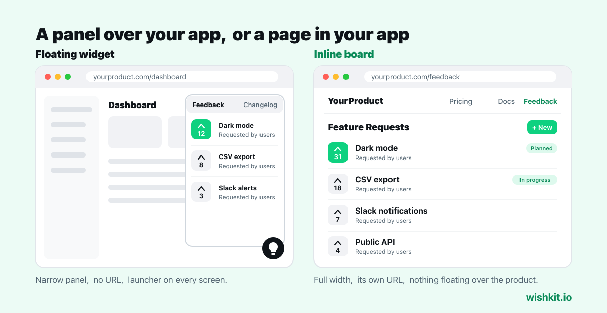
It is everywhere. The launcher sits on every page, so a user who hits a problem on the billing screen can report it from the billing screen. For bug reports and "this is confusing" moments, proximity matters, and a widget wins.
It costs no navigation. You do not have to find room in the nav, the footer, or the help menu. Paste the script and the entry point exists.
It bundles. Widget-first tools usually stack a changelog, a roadmap and surveys behind the same launcher. If you want all of that in one place, the widget is the natural container.
It has no address. A panel that opens over the page cannot be linked to. You cannot put "vote for this here" in a support reply, a release note, or a tweet. Users cannot bookmark a request or share it. For a feature request board, where the whole point is that people find and pile onto existing requests, that is a real loss.
It competes with your app. The launcher is a permanent floating call to action on every screen of your product, in the corner where your own chat, help, and cookie prompts already live. Every widget you add makes that corner busier and your own buttons less visible.
It is cramped. A side panel is a narrow column over your content. Browsing fifty requests, reading a discussion, or comparing two ideas is worse in a 380 pixel drawer than on a page. On mobile the panel takes over the screen and the "app" it was supposed to sit on top of disappears.
It hides the board from search. A public feedback page at a real URL can be indexed, and users searching for "does YourProduct support X" can land on the request and vote. A panel behind a button cannot be found that way.
It is a page. yourproduct.com/feedback, linked from the nav or the footer, with a URL you can send people to and a layout that uses the full width. Requests get room, discussions read like discussions, and mobile is just the page on a phone.
It looks like yours. The board sits under your navigation and inside your layout. With a Shadow DOM implementation, your CSS and the board's stay separate, and you match light or dark mode with one attribute instead of fighting an overlay's styles.
It does not nag. Nothing floats over the product. Users who want to give feedback go to the feedback page, and users who are working are left alone.
It needs an entry point. You have to link it from somewhere users look. That is one nav item or a footer link, but it is a decision you make, and a board nobody links to collects nothing.
It is not contextual. A user annoyed on the billing screen has to go to the feedback page to say so. For bug reports that is friction. For feature requests, which are considered rather than reactive, it barely matters.
| Floating widget | Inline board | |
|---|---|---|
| Reachable from every page | Via a nav or footer link | |
| Has a URL you can link and share | ||
| Findable by search engines | ||
| Room to browse and discuss | Narrow panel | Full page |
| Stays out of your app's UI | ||
| Best for | Bug reports, contextual feedback | Feature requests, voting |
Collecting bug reports and reactions: a widget, or a support chat that already does this. Proximity to the problem is the feature.
Collecting and ranking feature requests: an inline board. Voting needs browsing, browsing needs space, and a request people can link to gets more votes than one they have to describe.
Both: keep the support chat you have for the first job and add a feedback page for the second. Two tools doing one job each beats one widget doing both badly. The feedback page takes two lines of HTML. The walkthrough is in how to embed a feedback board on your website.
And whichever you pick, label the entry point "Feedback" or "Feature Requests". A floating lightbulb with no words and a nav item called "Ideas" both cost you submissions from people who were looking for exactly this.
You can put the anchor in any container, including a modal, and it will render there. But you lose the URL and the search visibility, which are most of the reason to go inline. A dedicated page is the better default.
Both are a script tag. A widget needs the script on every page. An inline board needs it on one page plus an anchor element. Neither takes more than a few minutes.
Only the feedback page loads it, and the script loads asynchronously, so the rest of your site is untouched. A widget, by contrast, runs on every page whether the visitor uses it or not.
Sleekplan and Frill are built around a floating widget. Canny and Featurebase are hosted portals with an optional widget. WishKit renders inline on your page and natively inside iOS and macOS apps. See WishKit vs Sleekplan for the widget-versus-inline comparison in detail.
WishKit lets your users request features and vote on them, in your app or on your website, so you know what to build next.
Try WishKit for freeFree plan included, no credit card required.
