The long list of icon sizes is history. Here is the one size per platform Apple asks for today, where the App Store icon comes from, and how dark, clear and tinted icons work.
By Martin Lasek · Oct 8, 2026 · 6 min read
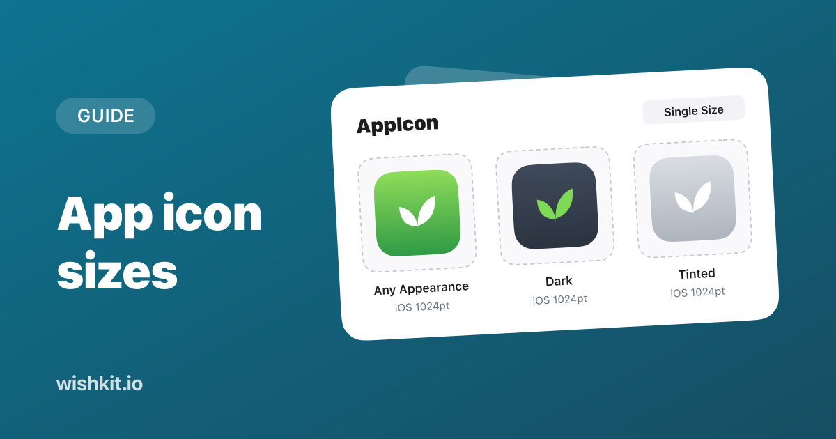
The iOS app icon size is 1024 × 1024 pixels, and the same size covers iPad and Mac. You provide that one image and the system scales it down for the Home Screen, Settings, notifications and search. The App Store icon comes from the same image in your Xcode project. Apple Watch icons are designed on a 1088 × 1088 canvas, Apple TV icons are 800 × 480, and Apple Vision Pro icons are 1024 × 1024.
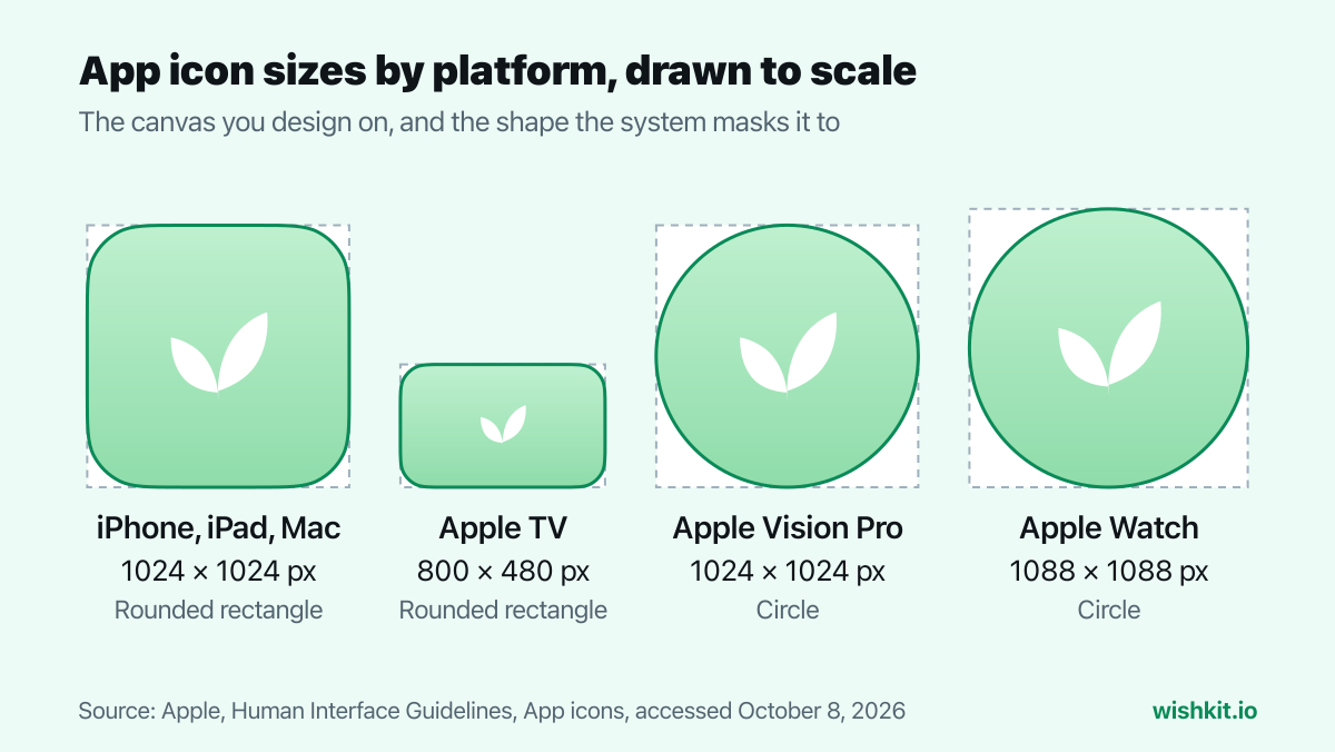
From the specification table in Apple's Human Interface Guidelines, last changed on June 8, 2026:
| Platform | Layout size | Shape after masking | Appearances |
|---|---|---|---|
| iOS, iPadOS, macOS | 1024 × 1024 px | Rounded rectangle | Default, dark, clear light, clear dark, tinted light, tinted dark |
| tvOS | 800 × 480 px | Rounded rectangle | None, layered for parallax |
| visionOS | 1024 × 1024 px | Circle | None, layered in 3D |
| watchOS | 1088 × 1088 px | Circle | None |
Every layout is a square or a rectangle. You don't round the corners or cut the circle yourself, the system applies that mask. The same page lists the color spaces icons can use: sRGB, Gray Gamma 2.2 for grayscale, and Display P3 for wide color on every platform except visionOS.
Many icon guides still list a dozen sizes per device, like 180 × 180 for iPhone and 167 × 167 for iPad Pro. Apple's current documentation doesn't ask for them:
"iOS, iPadOS, tvOS, and watchOS apps can auto-generate all icon variations from a single 1024×1024 pixel image. This is the default behavior when you create a new iOS, iPadOS, tvOS, and watchOS app, or a new icon in the asset catalog."
In the asset catalog this is the Single Size option. All Sizes still exists if you want to hand-tune small versions, for example to show more detail at a large size. Two exceptions in the asset catalog: Mac and Apple TV icons need an image for each size, and visionOS takes one 1024 × 1024 image.
Apple Watch has two numbers depending on where you look. The asset catalog generates watch icons from the same 1024 × 1024 image. Icon Composer and the design guidelines use a 1088 × 1088 canvas for Apple Watch, so design at 1088 when you build your icon in Icon Composer.
There is no separate upload in App Store Connect. The App Store icon is part of your build, in the image well Apple names for each platform:
That also means the icon changes only with a new version:
"If you want to change your app icon after publishing, you must create and upload a new version of your app. Then, submit it for review."
On iPhone, iPad and Mac, people choose how Home Screen icons look: default, dark, clear or tinted. You can design each variant yourself, but you don't have to:
"You can design app icon variants for every appearance variant, and the system automatically generates variants you don’t provide."
If you provide them through an asset catalog, Apple's instructions are specific: "Provide your tinted app icon as a grayscale image. Provide your dark app icon with a transparent background so the system-provided background can show through." Keep the same artwork in every variant. Apple warns against swapping elements between them, because people should still find your app after switching appearances.
Since Liquid Glass, Xcode's own icon documentation points to Icon Composer first. It's a tool that comes with Xcode (Xcode, Open Developer Tool, Icon Composer). You import your layers as SVG or PNG, organize them into up to four groups, set the Liquid Glass effects, and preview every platform and appearance. The result is one file for iPhone, iPad, Mac, Apple Watch and the App Store.
"If you add an Icon Composer file to your Xcode project, it replaces any existing icon asset catalog that you previously used to represent your app icon."
For older iOS versions, Xcode generates a similar-looking icon from the file at build time. If you want your existing icon to keep showing on those versions, Apple says to stay with the asset catalog. Apple TV and Vision Pro icons still live in an asset catalog either way.
Offering alternate icons in your app's settings? Each one needs "their own dark, clear, and tinted variants", and all of them go through App Review, as the guidelines note.
The icon ships in your build, while App Store screenshots go up separately in App Store Connect, at their own required sizes. Once the app is live, WishKit lets your users request and vote on features inside it.
1024 × 1024 pixels. Xcode generates every smaller size from that one image.
Also 1024 × 1024 pixels, from the iOS 1,024pt image well in your Xcode project or from your Icon Composer file. You don't upload it separately in App Store Connect.
No. Apple's asset catalog generates them from a single 1024 × 1024 image by default. You can still provide them with All Sizes if you want to fine-tune small versions.
Apple's design guidelines and Icon Composer use a 1088 × 1088 pixel canvas, masked to a circle. An asset catalog generates watch icons from a 1024 × 1024 image.
No. The system generates dark, clear and tinted variants you don't provide. Design your own if you want control over how they look.
Only with a new app version that goes through App Review. The icon is part of your build, not of your App Store Connect metadata.
Setup takes less than a minute. Free plan included, no credit card required.
Try WishKit for free